Since I'm on a roll with the dining room I think I'll keep moving full steam ahead.
Otherwise, I'll get distracted and start another project before finishing this one!
Here's what I'm thinking for the walls on each side of the French doors.
(on left side of photo)
I love the look of art hung from floor to ceiling...

I love the look of art hung from floor to ceiling...

elementsofstyleblog.com
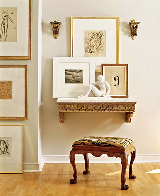
but then symmetry of this speaks to me, too...

decorpad.com
or, an abstract paired with my traditional pieces...

decorpad.com
or, a statement these oversized botanicals would make...


14 comments:
I love the abstract with the traditional elements!
I love all of these, but I especially am drawn to the symmetrical groupings. I've always loved those. But you can't go wrong with any of these beautiful examples.
Stacy
I think you are onto something Pam....liking your direction! Of course I am also quite taken with those over-sized botanicals, so many choices...
Cathy
No doubt you'll knock it out of the ballpark with whatever you decide. They're all beautiful!
That's a tough one! I think I'm with Cathy. I also like the two large botanicals, but I also really like the floor to ceiling look as well.
They are all beautiful but I do like the floor to ceiling look a lot. I am glad to see you are on a roll with this room. I am all over the place right now with my projects!
-Shelley
Such beautiful photos. I love them all. Can't wait to see what you create.
The floor to ceiling look is really neat. Hmmm. Not sure WHAT I would do! Will be fun to see what you decide
I love the abstract painting idea, for a touch of unexpected (and humor!)
I like the direction you're going. I'm a little partial to the gold frames. All of the choices are lovely!
I love that abstract art! :)
I am not a personal fan of too much symmetry and I like a mix of pieces so I would go with the first.
Nyahh... Im simple Lisa, i love furniture that is simple... and i love wooden furniture because i can remodel or redesign it as soon as it looks old...
Omg these pictures are just amazing, I love them, amazing room, I especially like the second picture, great color combinations, nice selection! Your blog is lovely and I'm a new follower! Hope you'll like my blog and follow back!
Pop Culture&Fashion Magic
Post a Comment
When you leave a comment whether simple or detailed, it brightens my day!